Arabic writers, why so bold?
I have a bit of a rant.
First, I would like you to do me a favor and go visit this page: http://goo.gl/lyylAu. It is a technology blog in Arabic. Even if you can’t read it, please just take a look. Now, trot along with me to another page, this one a web forum (nominally dedicated to Harry Potter fandom, but this article is about an interview with John Hurt: http://goo.gl/SEqdjg. And another forum posting here (this time with a light background) about protecting the v-Bulletin admin control panel from hackers: http://goo.gl/4oyNUz
What do you see? The more “professional” technology blog used a few different fonts, used bold text for titles, and it looked… normal. To me, at any rate. The two web forums? Everything is bold.
Why so bold?
I’ve seen this in Arabic on the internet since I first started seeking out Arabic on the internet in around 1996 (back then you had to use Arabic Windows or the Arabic Language Kit on a Mac to see Arabic, now it just works. Thanks Unicode!). For some reason that I do not understand – and I would really like to hear an answer – many Arab writers seem to prefer bold text. I do not. I think it is the Arabic equivalent of TYPING IN ALL CAPS. I FEEL AS THOUGH I AM BEING SHOUTED AT. I don’t care for it.
I was willing to occasionally complain to friends or coworkers and then let it go, but then I started reading In Other Words: A Coursebook on Translation by Mona Baker. The book is very good so far. As I’ve mentioned, I am guiding a book club of like-minded translators through it. We have reached the sample texts in chapter 2:
With the above proviso in mind, we can now look at examples of strategies used by professional translators for dealing with various types of non-equivalence. In each example, the source-language word which represents a translation problem is underlined. The strategy used by the translator is highlighted in bold in both the original translation and the back-translated version. (2011, p. 23)
Sounds good, nice and clean, and easy to follow. In this section, there are examples in Arabic, Spanish, Chinese, Italian, Japanese, Greek and a few others. Rather than jump straight to the punchline, I’ll share a German example from page 33 (as an image):
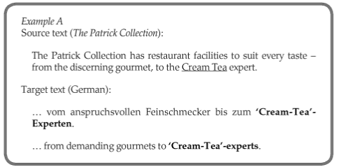
Looks great! I do not speak German, but I can follow right along. The same goes for Spanish, Greek, and the other Latin-based scripts. But for Arabic… Can you guess?
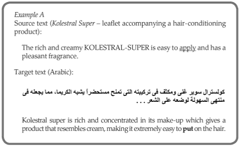
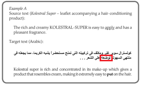
Anyone have a guess as to where put is in the Arabic sentence? If you do not read Arabic, here is a hint: the whole Arabic statement is in bold text. For the curious, here it is (I have used a red box to mark put):
Now, in the first edition of the book – published in 1992 – typesetting mixed Arabic and English was a bit more difficult than it is today. I could forgive the typewriter-like font and bold-appearing text back then; it was just nice to have Arabic samples in an English book on translation. Now, however, things are a lot easier (thanks again, Unicode!). Anyone with a copy of Microsoft Office, OpenOffice (or its sisters), or InDesign (for real DTP) can properly lay out Arabic text. I am not an expert in Arabic typography or DTP, though I am trying to learn more about both, but I can tell a bold font from one that is not. Add to that that the Arabic used in the cover art is broken… It is disconnected (this is from the web page, but the graphic is the same):

The Arabic word here is supposed to be لغة, language (لغة for those who prefer bold…).
Oh, and by the way, I do not read Chinese or Japanese, but I think the book has the same problem for both of those languages. Here is an example:

So, again I ask: why so bold?
Leave a Reply