
I commute to work each day by bus, about an hour or so each way. Perfect reading time, and my Kindle Voyage is an excellent companion. As I look around at my fellow passengers, I see the majority of them messing about with games on their phones, a few read “real” books, and there are others who also seem to like the Kindle’s paperwhite screen. Two of the ladies that I see on a relatively regular basis read in languages other than English – I haven’t been rude enough to interrupt and ask, but from a distance, it looked like Japanese. Frankly, I’m a bit jealous. So I periodically go digging and try to read some Arabic on my Voyage.
 I’ve noted before that the Kindle Voyage appears to be getting close to a good display of Arabic; you have to side load the Arabic documents somehow – I usually use email to my Kindle address. I recently had a set of web articles (book reviews) that I wanted to read, but I prefer to read on the paperwhite screen. Someday I’ll have enough ‘free money’ laying around that I’ll be able to buy an Android tablet with an e-ink screen so I can just install all of the normal apps – including MS Office apps – directly on it and read files natively. Someday. Until then, I do a lot of “send to Kindle” either through email or from my web browser. In this instance, I copied several articles from the ‘net and put them into a single MS Word document and formatted it for printing. Then I thought I should just send it to my Kindle, running version 5.9.4 as of this writing, and see what happens.
 At first glance, you probably thought the same thing I did: That looks pretty good! Let me pile on a couple of other “pretty good” things before I start on what makes it painful to really use. If you long-press a word, it highlights it and, if you are connected to wifi, looks for a Wikipedia article. You can also tap the “translation” tab and get an actual lookup (though the dictionary doesn’t work – that is dependent on an actual dictionary being installed, not supported for Arabic yet). You can see here that the translation (for the Arabic word سلطة), for some reason, shows up on top of the text that says “Translating your selection.” If you swipe back to Wiki or the dictionary and then back to translation, the ghost text disappears. They use Bing translator.
Then we get into the nitty-gritty, the stuff that starts to get to you after you’ve been reading for an hour – or sometimes has you puzzling over a word, getting out of your comfy reading chair and going back to the PC to figure it out.
 The first one is the text alignment. Those of you who don’t read Arabic probably don’t care about this post anyway, but if you are reading, I’ll do my best to include you. Arabic is a right-to-left language. That means the text starts on the right hand side of the page and words progress to the left, with most letters connected sort of like cursive handwriting in English (but with some very interesting rules). If you look at this “big picture” carefully, you’ll notice that the text is nice and even down the left hand side of the page, and a bit random down the right hand side. Not that unusual for English documents, but for Arabic, it should be the other way around – or at least make it fully justified and square down both sides. This hints that the Kindle isn’t fully bi-di (bidirectional text) aware. However, when I went to a location with an English word integrated into the text, it was in the right place and did not break up the word order. So the problem likely lies with alignment rather than text direction or flow, and ought to be a relatively easy fix. Of course, I don’t know what the code behind the Kindle display looks like – and I’m not a developer – so it could be enormously complex and I’m an idiot. I’ll accept that.
Second, I’m not a fan of the font. I’ve gone into the display settings and tried all of the available fonts; the spacing between characters and lines changes when you change fonts, but the actual display font does not change. This font is a bit open and loopy and reminds me of Moroccan script. Not as embellished as something handwritten, but some similarities. Let’s take a closer look at some of my nit-picking.
 The font is dynamic, like all fonts on the Kindle. Certain sizes seem to have some spacing issues. I usually have mine set at a 7, and I found this. The m م (indicating the Gregorian year) should not be under the 2, and the close parenthesis should not be over the 2 either. Both problems go away if I bump up to 8 or down to 6.
Before we go on to another image, let me pick on a couple of things in the التي as well. There is a left hook at the top of the lam that I’m not a big fan of, but the dots of the ya’ touching the bottom of the letter are even more annoying to me.
 Another thing that I’ve noticed is that the diacritical marks – which aren’t often used – turn hideous when they are. Take a look at this tanween – two kasras (for the -in sound) on موازٍ here. It looks more like someone has crossed out the z.
 In this next example, you can take a look at how the final ت is connected to the ط. There is a little loopy shape between the ط and the ت … oh, wait! I just checked the original Word document for this, and it turns out the phrase is فور أن تنطق, and that last letter is not a ت but a ق. Interesting; the ن goes below the line of script a little, why not a ق? That dip below the line is one of the distinguishing characteristics of that letter.
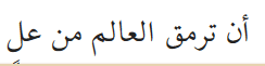
 And I guess this answers my next question which was: what letter is connected to the T ت here? None, it is meant to be a ق, and the circle that is crowding it out from the right is an m م, but this is almost impossible to tell because there is essentially no space between the two letters. Before doing all of this digging, and looking back at the document on my PC, I thought the word was ترهت. According to the Word document, this phrase is أن ترمق العالم من علٍ This phrase also gives me the chance to talk about the ayn ع and ghayn غ – in most fonts (including the one you are likely using) a medial ayn/ghayn has a flattish top to distinguish it from the more round fa/qaf ف/ق shapes: ـعـغـ vs. ـفـقـ. In this font – the third word from the left is العالم and the ayn is round and solid and a bit smaller than the fa shape. In this case, I was able to tell what the letter was meant to be, I just don’t care for its design.
 If someone were to ask me, and no one has, I would recommend using an OpenSource font, something available under the GPL that is both traditional and easy to read. This provides for easy scaling and no problems with licensing. One very nice option might be KACSTBook, shown here (using the sampling tool at https://fontlibrary.org).
 I also like the free Dubai font. If the folks at Amazon chose the font they are using because someone likes that more modern and rounded aesthetic, I think the Dubai font does it better and remains extremely readable. Here is a sample, using the same text. Note how all the letters are clear, and the tanween is visible without covering the tail of the lam ل.
I’ve spent a lot of time picking on the font. I sincerely hope Amazon picks something else before Arabic support is “officially” announced, because I think the current font makes certain letter combinations almost impossible to puzzle out – if I hadn’t been able to go back to the Word document on my PC I would never have guessed ترمق for that word!
With a change of font and better alignment options, we’ll have a winner. It would be awesome to have a dictionary for purchase and an Arabic keyboard to do searches, but even without those things, it becomes a very welcome reading tool.


